August 2026 Updates
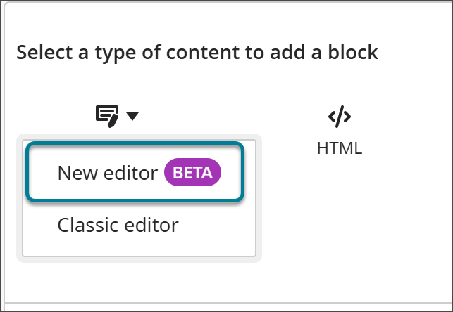
Early Access: New Content Editor for Blackboard Documents
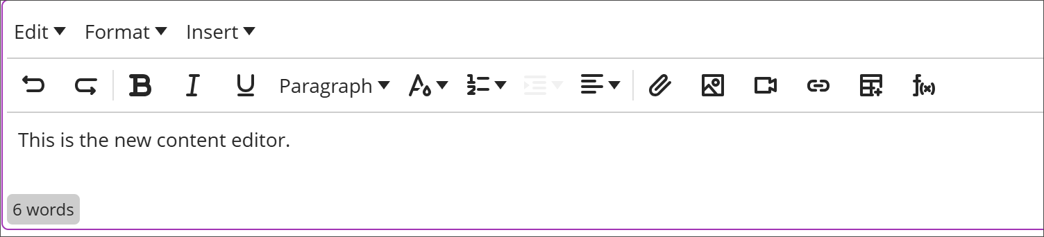
The new editor improves content authoring consistency and efficiency with these enhancements:
- A simplified authoring experience: reorganised menus and a streamlined toolbar
- More powerful content formatting: enhanced list and table capabilities
- Improved accessibility and future-ready foundation: better keyboard navigation and modern shortcuts
When working with content blocks in Documents, instructors can choose between the new editor and the current editor.
For instructions, please click here.
Manage group membership with drag and drop
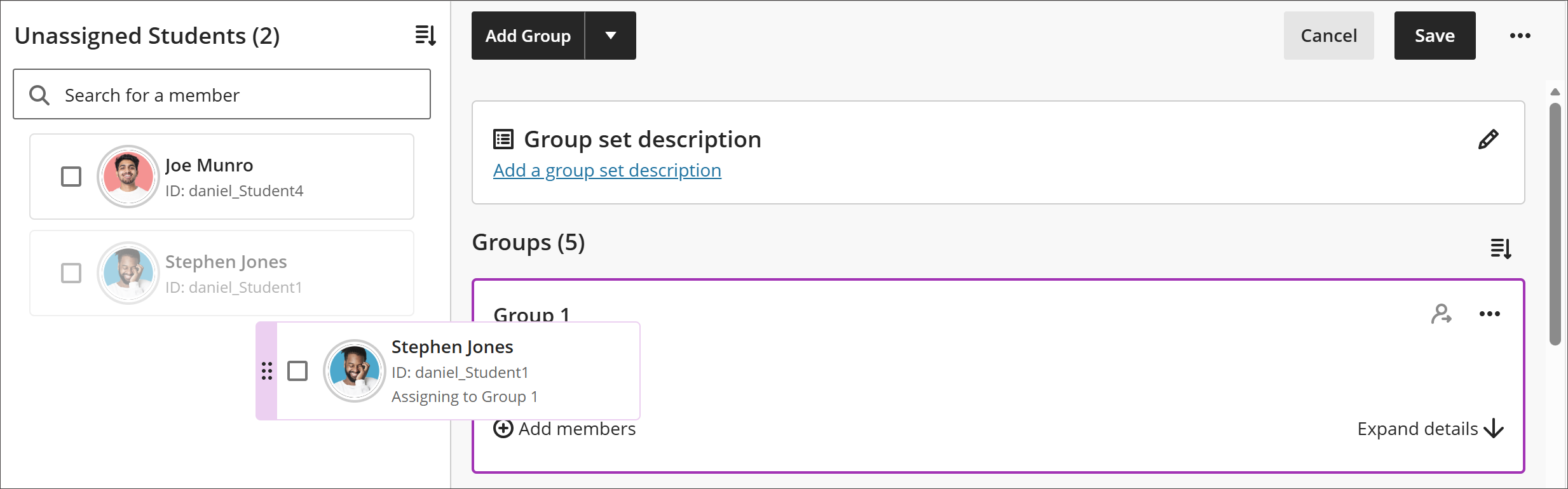
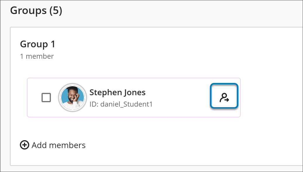
Instructors can now use drag and drop to manage group membership in the Groups management experience.
From the Groups management screen, instructors can:
- Drag students from the unassigned list directly into a group
- Remove individual students from a group instead of removing them all at once
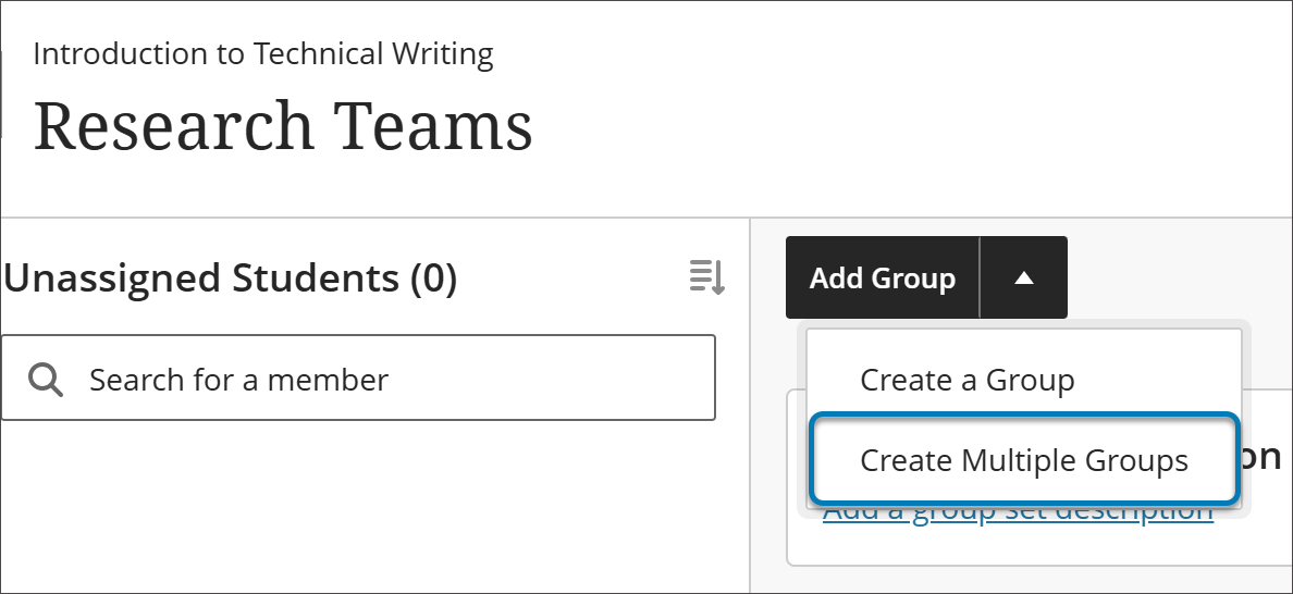
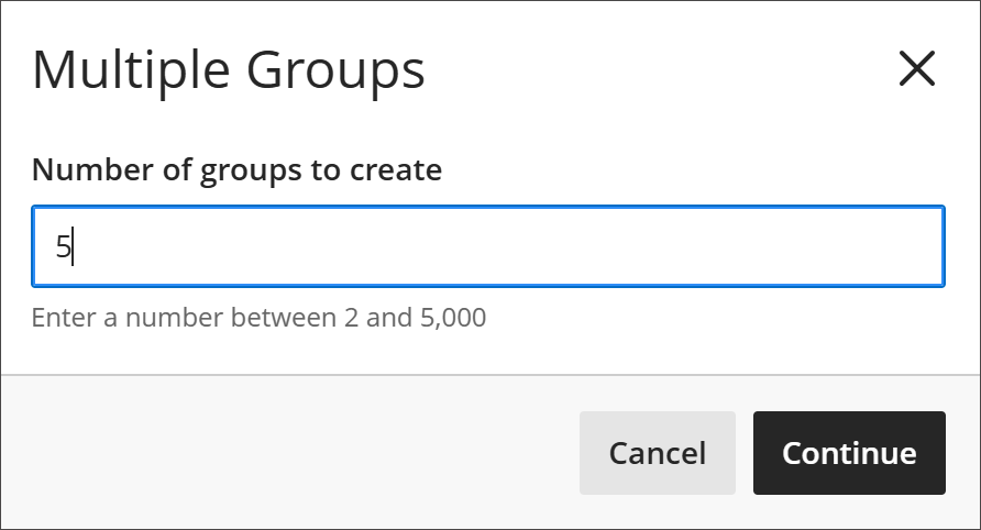
Create multiple groups at once
From the Groups management screen, instructors can create between two and 5,000 groups in one step rather than creating each group individually. Once the groups are created, instructors can populate them using the existing options, including manual assignment, automatic enrolment, and import.
Make notifications more accurate and reliable
We’re improving the reliability and accuracy of Blackboard notifications. This release includes the following notification improvements:
- Correct notifications for assigned groups. Students now receive DUE and OVERDUE notifications relevant to their assigned group instead of for all assigned groups in the course.
- Grade updates and changes in digest emails. Digest emails now include notifications when a grade is updated or cleared.
- Reliable digest email delivery. When a digest email fails to send, the sender won’t inaccurately receive a notification marked as delivered.
- Correctly timed announcement emails. Announcement emails are now sent only after the announcement’s start date is reached and not before the content is visible to students.
Add sorting controls for users in Discussions
Instructors and students can now sort discussion posts by newest first or oldest first. Instructors can also set the default order students see. By default, students see posts newest to oldest, but instructors can change this to oldest to newest, placing the oldest post at the top of the discussion with newer posts below.
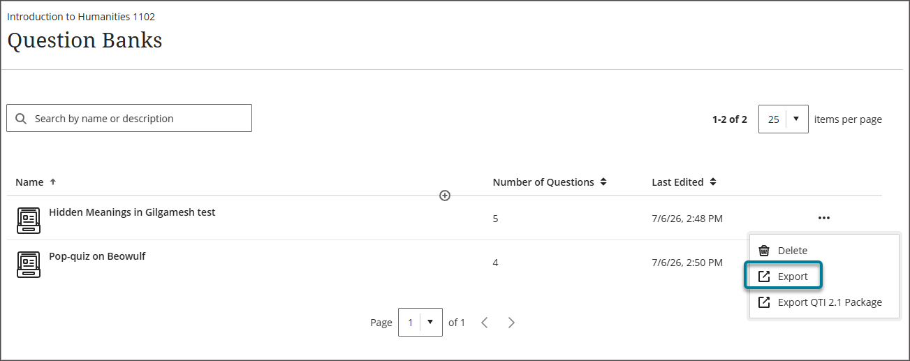
Export question banks
Instructors can now export a question bank as a file to their local device. This makes it easier to back up assessment content or share with other instructors for reuse across courses.
Display answer-level feedback for selected options only
Students now receive answer-level feedback only for the options they chose in multiple choice questions, giving students more targeted insight into their responses without revealing feedback for options they did not select. Instructors continue to enter feedback for answer options when creating or editing a multiple-choice question, using the same Option Feedback workflow. After submitting an attempt, students receive feedback only for the answer option or options they selected, rather than feedback for every option.
Navigate courses faster with an improved user interface
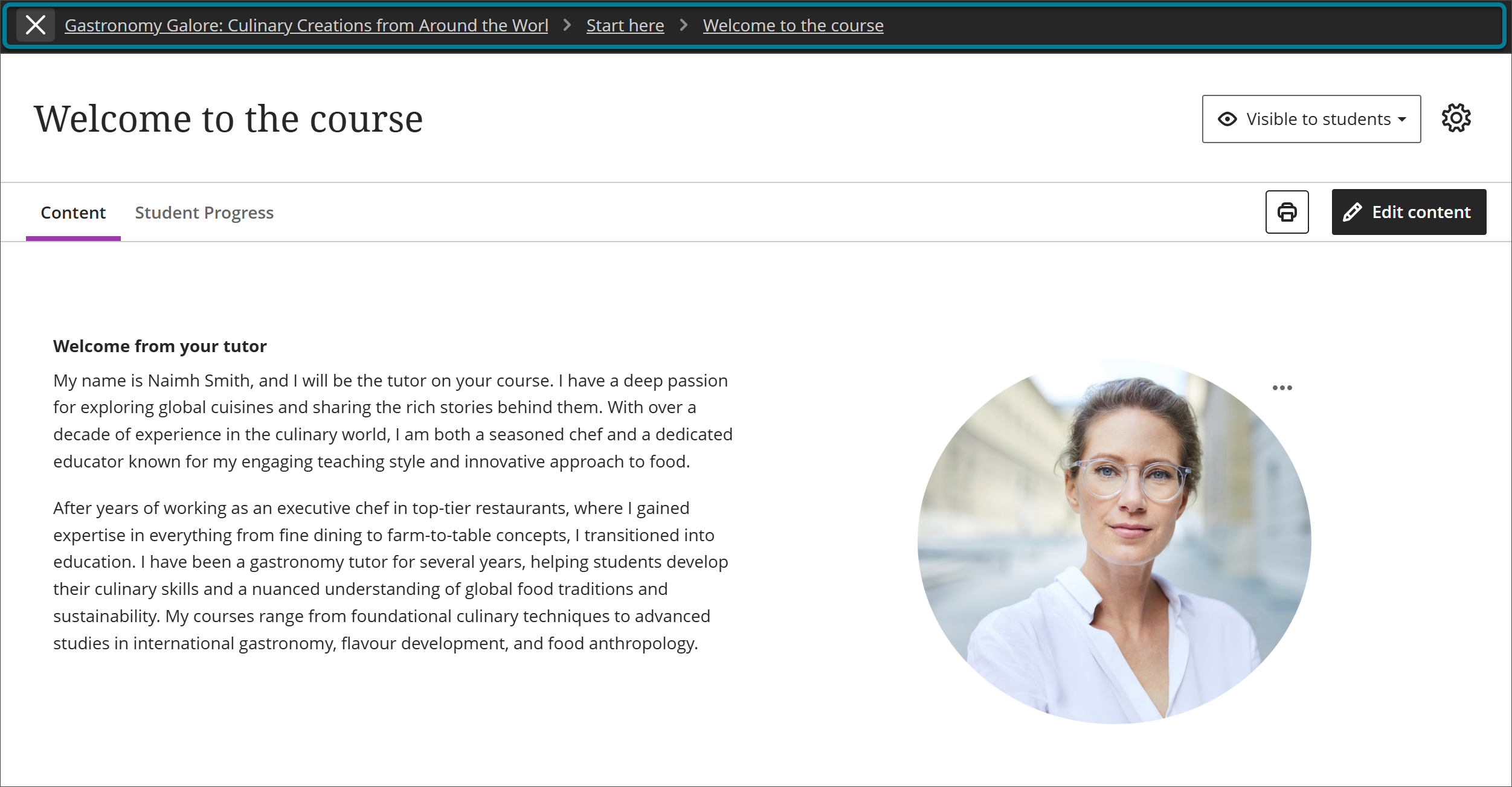
This update builds on the refreshed interface extending full-page navigation deeper into course content and delivering several newer enhancements—including breadcrumbs and a clearer way to exit content. Course content and structure remain the same. Instructors do not need to redesign or reconfigure anything.
Full-page content navigation
Learning modules, folders, and individual content items, such as documents, assessments, links, and media, now open as full pages instead of sliding panels layered over the course outline.
Breadcrumbs for contextual clarity
Breadcrumbs now appear on content pages, showing where you are within a course’s module and folder structure to add contextual clarity.

Clearer, intentional exit from content
The purple “X” button previously used to exit content is replaced with a clearly labelled exit option in the navigation banner. Because the exit action is now more deliberate and separated from other controls, instructors and students are less likely to close a page or lose their place by accident.
Focus state for tests and assignments (Students)
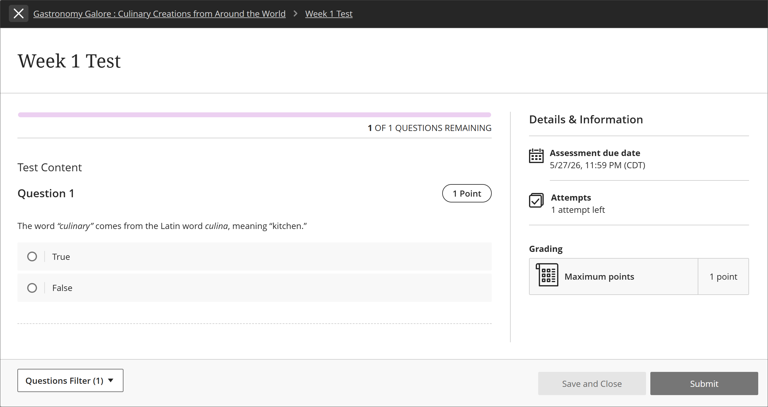
When students begin a test or assignment, they automatically enter a new focus state that minimises navigation elements and visual distractions, presenting a streamlined interface for completing assessments. Focus state does not change how assessments function or are graded, and students can still navigate away if needed—it reduces distractions without trapping them. No action is required from instructors. Focus state cannot be turned off.
Navigate between courses faster with the updated Home button
Selecting Home from a course takes you directly to the Courses page in the base navigation, so you can move from one course to the next more quickly.

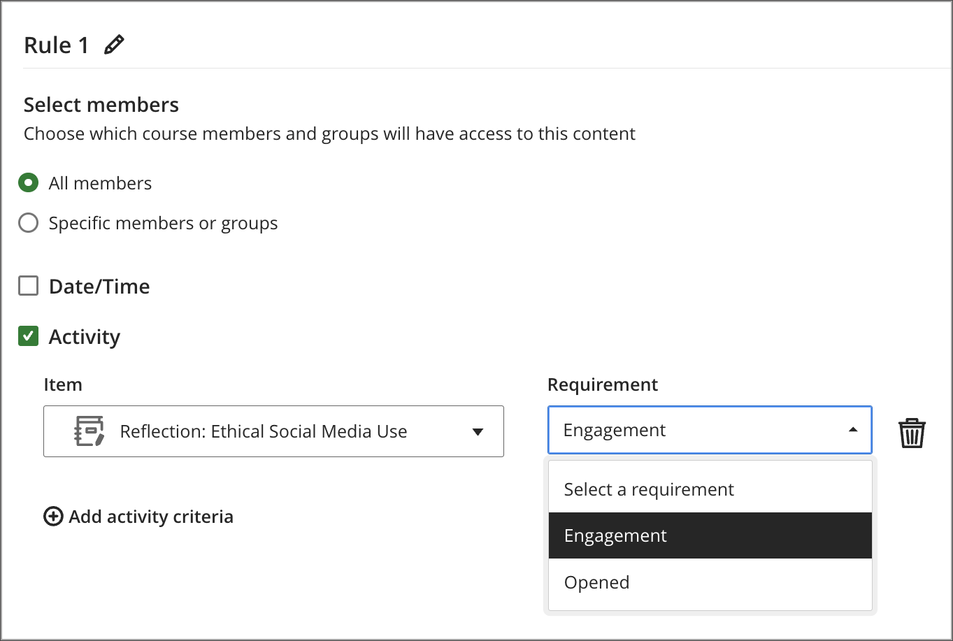
Set release conditions based on journal submissions
Instructors can now set release conditions based on the submission status of journals.
Instructors
When setting release conditions for course content, instructors can now choose journal submission status as a condition. Content releases automatically once a student submits, without requiring the instructor to grade the submission first. Submission status is recorded as complete in progress tracking.